I am in the Finals! Vote for your Favourites in the Beta Cover Contest

Hi guys, it is that time again. I was chosen to be one of the 10 finalists in the Beta cover design contest hosted by Hyperion Teens.(And yes, I am doing selfless promotion here by making my cover the biggest ;P)

Voting starts today and you can vote daily.

Read more »

I am in the Finals! Vote for your Favourites in the Beta Cover Contest

Hi guys, it is that time again. I was chosen to be one of the 10 finalists in the Beta cover design contest hosted by Hyperion Teens.(And yes, I am doing selfless promotion here by making my cover the biggest ;P)

Voting starts today and you can vote daily.

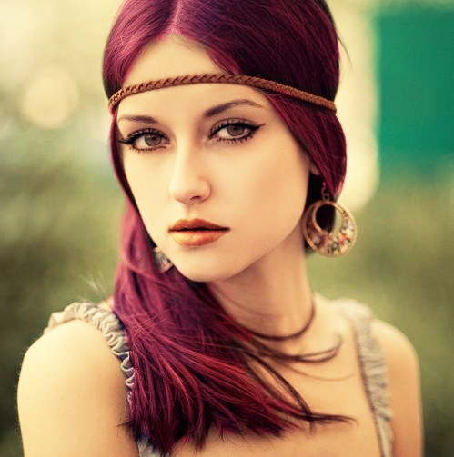
I started with a more romantic approach with the cover instead of sci-fi. The bird cage behind the Elysia symbolizes her nonexistent freedom. The heart symbolizes her emotions, and the motto, “I do not wish, I serve” is right above the heart, covering her emotion, (but note, the motto does not cover the whole heart). I tried to design a pattern for the fleur-de-lis that was more feminine and that matched with the birdcage. I also made sure to include the BETA tattoo she has on the back of her neck (which is partially covered). I made sure the girl I designed have fuchsia eyes and honey hair but I kept the colour fairly light in order to not contrast with her skin tone too much but still make it visible. I tried to bring the sci-fi element more in with font I used for Rachel’s name, but so in the title. If you look closely the half of the title contains astronomic stars. The purpose of it was to create the illusion of this sci-fi feeling and this other worldly creation effect. I didn’t go full out “sci-fi font” in order to keep a harmony with the whole piece. Also, I stayed in the pinks, fuchsia, purple tone that are present a lot in the novel. And lastly, the vintage lace fringes used at the bottom balanced out the swirls and twist at the top of the cover with the birdcage, Elysia’s headpiece and of course the fleur-de-lis. I hope you guys enjoy this. ❤

Other finalists:


Vote for your Favorite Cover Designs (Again)

So hi guys, it is that time again, yes, from the title you already know what this is about. Hyperion Teens once again held a design contest, and this time it was for Dan Krokos' False Memory. And now the finalists had been chosen and it is time to vote! And wow there are some great, no, amazing entries which I know I will be voting for. But just so you guys know, my entry is this one

My entry is Kontemporary Krokos

Read more »

Vote for your Favorite Cover Designs (Again)

So hi guys, it is that time again, yes, from the title you already know what this is about. Hyperion Teens once again held a design contest, and this time it was for Dan Krokos’ False Memory. And now the finalists had been chosen and it is time to vote! And wow there are some great, no, amazing entries which I know I will be voting for. But just so you guys know, my entry is this one

My entry is Kontemporary Krokos

I will repeat what I wrote for my design when I entered the contest.


I went for a more contemporary style to Dan’s False Memory. 🙂 I kept the main fonts in the style of sci-fi to reflect the book (which is widely considered to be a YA sci-fi novel). I hope this almost “false” genre twist can display the dystopian, and mystery undertones of the book, showing that things are not always what it appears to be. Furthermore I hope that by creating a contemporary cover, it will also demonstrate to the audience that there is romance in the novel. I really hope you guys enjoy this. It was an absolute pleasure to make. 🙂


And sadly, I haven’t read the book. *hits self and whispers* I am embarrassed to say that. So the design was based off an excerpt. I hope you guys enjoy it. 🙂

You can vote daily so if you like an entry, vote for them. I will leave you guys a link to all of the entries so you can see what the others had made. Dan Krokos Design Finalists.